Alignment Study
Typography Alignment Art Print Overview
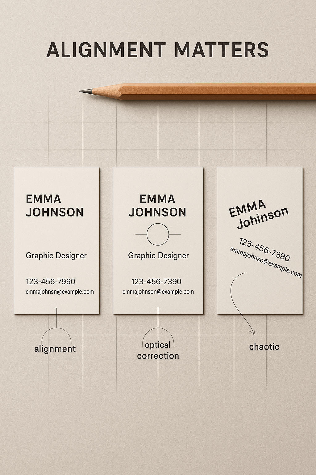
The Typography Alignment Art Print explores how visual balance impacts perception through three business card designs. Side by side, it contrasts perfect alignment, optical correction, and chaotic layout. The Typography Alignment Art Print is ideal for designers, students, and educators seeking to understand typographic harmony. Moreover, it uses clear examples to show how spacing and structure influence readability and professionalism. This print is both instructional and visually refined. Furthermore, its minimal grid background reinforces the design message. The Typography Alignment Art Print fits effortlessly into modern studios or educational settings. In addition, the clean layout and muted palette keep the focus on the concept. However, its subtle design insights make it far more than a simple comparison. The Typography Alignment Art Print offers clarity, balance, and guidance for anyone serious about design precision.
Key Features of Typography Alignment Art Print
- Side-by-Side Comparison: The Typography Alignment Art Print shows alignment, optical balance, and chaotic layout variations.
- Design Clarity: Visual labels explain key alignment and correction concepts with simplicity.
- Clean Presentation: Grid background and soft neutrals enhance focus and concept delivery.
What’s Included with Typography Alignment Art Print
- One high-resolution, unframed Typography Alignment Art Print (available in standard sizes for framing).
How to Use Typography Alignment Art Print
- Frame the Typography Alignment Art Print with a simple border to preserve its clean, grid-based aesthetic.
- Display in design offices, studios, or classrooms to reinforce principles of visual structure.
Ideal Uses and Placement
- Perfect for design schools and creative workspaces, the Typography Alignment Art Print supports layout literacy.
- Ideal for design critiques, portfolio reviews, or workshops on alignment and spacing.
- Great for offices that value clarity and typographic accuracy in branding and print.
Typography Alignment Art Print Specifications
- Printed on archival matte paper with the Typography Alignment Art Print in soft neutral tones and precise linework.
Typography Alignment Art Print comparing aligned, corrected, and chaotic business card layouts”
Explore More Resources
- Find similar products: Products Page
- Gain further insights: Our Blog
- Enhance your understanding: AI & QA Resources
- Learn from experts: Typography.com on Alignment Principles
Why Choose Typography Alignment Art Print?
The Typography Alignment Art Print combines education and aesthetics in one elegant layout. It teaches alignment and optical flow clearly. Moreover, it fits modern creative environments perfectly. The Typography Alignment Art Print is ideal for those who value bal
$4.89
- ✅ Instant Download Available
- 🖼️ Ultra High-Resolution 4K PNG + JPG (4096×6144, 300 DPI)
- 🖨️ Prints Beautifully up to 13.6×20.5 inches
- ♾️ Unlimited Downloads
- 🔁 Commercial Use & Resale Allowed
- 💾 Digital Product – No Physical Item Shipped
- 📥 Instant Access via Download Link Post-Purchase
- 🛒 Want a Physical Print?
You can upload your downloaded artwork to services like Printful, Zazzle, or your local print shop to create stunning physical prints.
All 4K images include the label "4K" in their title.
If your selected image does not include "4K", please contact us for your complimentary upgrade.