Typography And Emotion
Less Is More Typography Art Print Overview
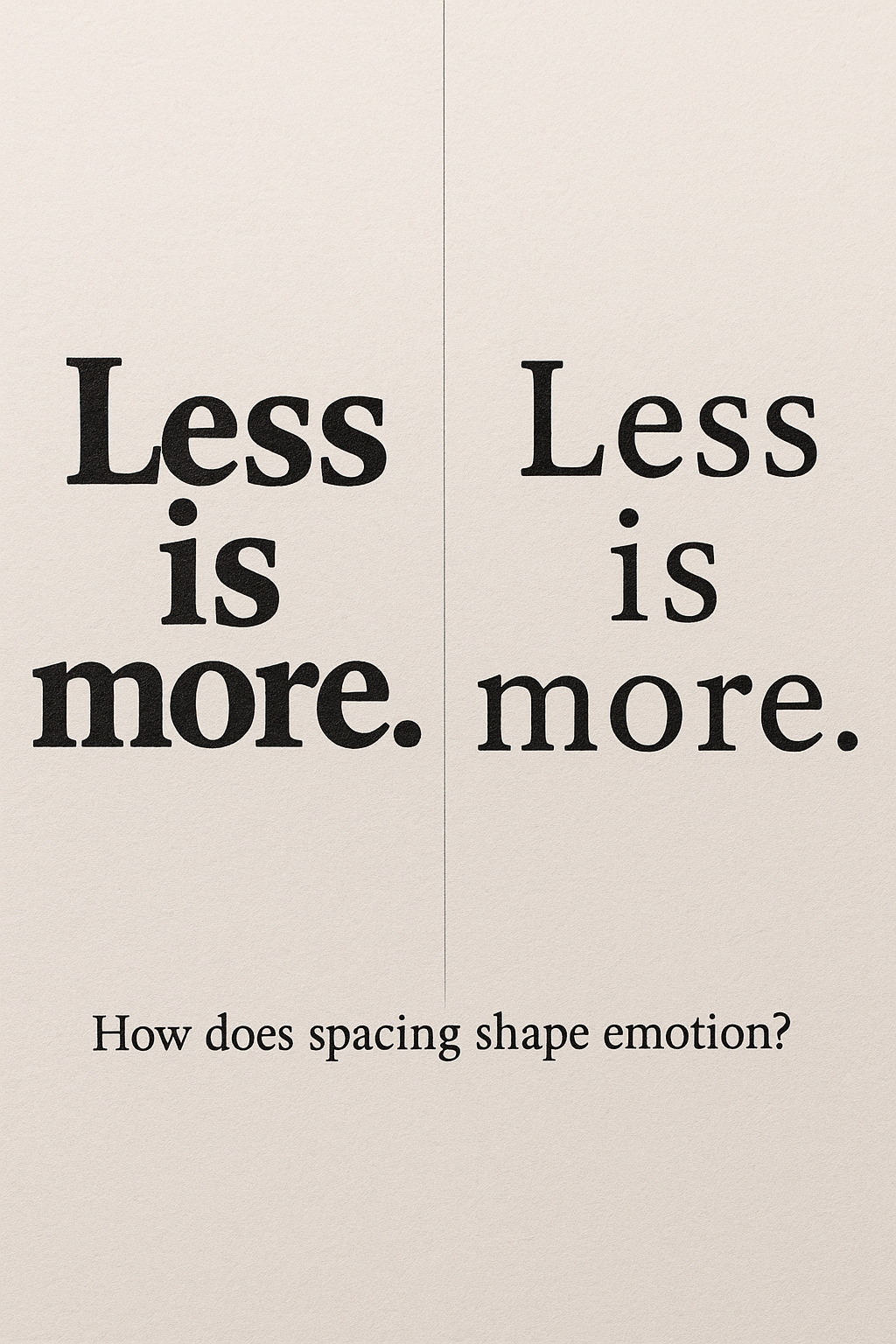
The Less Is More Typography Art Print visually explores how spacing influences perception and emotion. Featuring two variations of the same phrase, this design compares tight versus expanded vertical spacing. The Less Is More Typography Art Print is perfect for graphic designers, typographers, and anyone curious about visual psychology. Moreover, it prompts viewers to ask how structure affects meaning. The contrast is subtle yet powerful—inviting reflection on communication, simplicity, and design intention. Furthermore, the minimal presentation and centered layout enhance the message’s clarity. In addition, the neutral background and classic serif font make it adaptable for both creative and professional interiors. However, its impact is anything but neutral. The Less Is More Typography Art Print becomes a statement piece through its restraint and quiet power.
Key Features of Less Is More Typography Art Print
- Comparative Design: The Less Is More Typography Art Print shows two layouts of the same phrase to highlight spacing effects.
- Visual Questioning: The caption “How does spacing shape emotion?” sparks thoughtful engagement.
- Minimalist Layout: Clean lines and centered alignment emphasize contrast without distraction.
What’s Included with Less Is More Typography Art Print
- One unframed Less Is More Typography Art Print (high-resolution, available in standard sizes).
How to Use Less Is More Typography Art Print
- Frame the Less Is More Typography Art Print in a neutral-toned or minimalist frame for maximum impact.
- Hang in studios, creative offices, or classrooms to inspire mindful design decisions.
Ideal Uses and Placement
- Perfect for design studios that focus on typography, communication, or branding.
- Ideal in classrooms or workshops as a typographic teaching tool.
- Use in minimalist homes or offices to spark daily reflection on design choices.
Less Is More Typography Art Print Specifications
- Printed on archival matte paper with the Less Is More Typography Art Print in soft black text and cream background.
Less Is More Typography Art Print comparing spacing in typographic layout”
Explore More Resources
- Find similar products: Products Page
- Gain further insights: Our Blog
- Enhance your understanding: AI & QA Resources
- Learn from experts: Typography.com – Spacing & Emotion
Why Choose Less Is More Typography Art Print?
The Less Is More Typography Art Print combines clarity, contrast, and design insight in one minimalist piece. It makes viewers pause, think, and feel. Moreover, it’s ideal for interiors where thoughtful design matters. The Less Is More Typography Art Print proves that space, like words, speaks volumes.
Order Your Less Is More Typography Art Print Today!
Bring clarity and concept-driven design into your space with the Less Is More Typography Art Print—order now!
$4.89
- ✅ Instant Download Available
- 🖼️ Ultra High-Resolution 4K PNG + JPG (4096×6144, 300 DPI)
- 🖨️ Prints Beautifully up to 13.6×20.5 inches
- ♾️ Unlimited Downloads
- 🔁 Commercial Use & Resale Allowed
- 💾 Digital Product – No Physical Item Shipped
- 📥 Instant Access via Download Link Post-Purchase
- 🛒 Want a Physical Print?
You can upload your downloaded artwork to services like Printful, Zazzle, or your local print shop to create stunning physical prints.
All 4K images include the label "4K" in their title.
If your selected image does not include "4K", please contact us for your complimentary upgrade.